Lots of smart people have done lots of testing to figure out what works best on a website. Although you don’t need to follow all these “rules,” it’s a good idea to be aware of best practices.
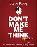
 Keep it Simple. You have fewer than ten seconds to grab your reader’s attention, so don’t over-complicate your web pages. There’s an industry-standard about web design called Don’t Make Me Think, Revisited: A Common Sense Approach to Web Usability — that’s good advice.
- Be clear about who your audience is. If you have more than one audience (readers who might buy your books, editors who might hire you to write a magazine article, clients who might hire you to edit their books), set up a separate landing page for each one.
- Help your readers know they’re in the right place. Begin your landing page (the “first” page of your website) with a clear statement such as, “If you’re a sales professional looking to expand your business, you’ve come to the right place” (if your book is for sales people) or “If you’re looking for heart-pounding fiction, look no further.”
- Be clear about the purpose for each page. Every page needs to have one — and only one — objective. Be sure you know what it is, and be sure it’s clear to readers, too.
- What do you want readers to do after they read a page? Sign up for your mailing list? Buy your book? Move on to read the next page? Be sure the next step is clear to readers by including a “call to action” such as “Click here to buy my book” on every page.
- Think — and write — in terms of benefits. How will your reader benefit from doing whatever you’ve asked them to do in your call to action? Will they learn something from reading your book? Will they be entertained or inspired? Those are fine benefits.
(You know about other “benefits” from reading and watching ads that promise you’ll be slimmer, sexier, smell better, avoid germs, vanquish tooth decay, etc. if you use specific products. Advertisers make those promises because benefit-oriented advertising works.) Be honest about the benefits; there’s no need to over-promise. - Build in search engine optimization (SEO). It’s a complex (and ever-changing) subject; here’s a good guide to SEO for photographers from Photoshelter. (Thanks to photographer John Montgomery for sending the link.) And here’s a link to Google’s Search Engine Optimization Starter Guide.
- Be sure you’re getting the email addresses of people who visit your website. The best way to do this is to ask them to sign up to be on your mailing list, and offer them a small gift for doing so.
- Write your welcome or “About Me” page in the 1st person, so readers feel they’re communicating directly with you.
- Write your author bio in the 3rd person, so members of the press can pick it up and use it without having to rewrite.
Speaking of rewriting, some day I’ll rewrite this website so it follows all these best practices.
There’s lots of info available to help you build your site effectively. Here are a few good places to start:
- An article called How to Assess and Critique a New Client’s Existing WordPress Site. It’s written for web designers (not authors), but useful because it discusses appearance, layout, and user experience; messaging and content; and optimization.
- Here’s a good article about how to optimize your About page.
- And, to give you a feel for the kinds of deep-dive information that’s available, here’s Hubspot’s report, Data Driven Strategies for Writing Effective Titles & Headlines. In it you’ll learn that headlines that perform best tend to be of moderate length) between 81 and 100 characters) and that including positive superlatives (“best”, “always”) in headlines decreases the click-through rate. That’s the word this year, anyway — best practices keep changing as the internet evolves.
Back to Your Author’s Website.
